Brand Guide
Canvas Financial
This guide provides the tools and standards to ensure the Canvas identity is applied consistently across all touchpoints. From logo usage to typography to color, and brand application, these guidelines help us present a unified, confident & professional brand—everywhere Canvas shows up. The link below provides a top-level folder for all the brand elements.
The core of our brand
Our Logo Suite

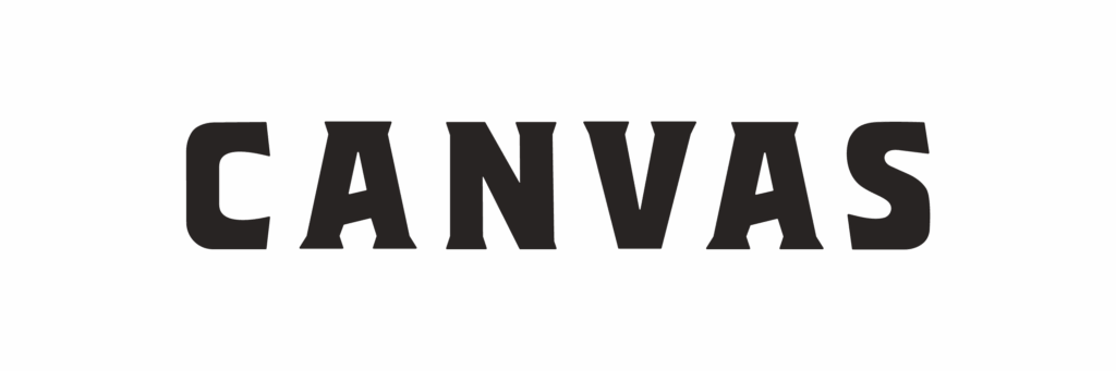
Primary Wordmark Logo
The Canvas logo is set in a modern-industrial, western-inspired typeface that's tracked out. Combining tall, condensed serif letterforms of model-like proportions with a thoughtful and energetic italic serif, our logo leaves a striking, enthusiastic, and editorial first impression.

Wordmark Blue with no BG
Wordmark Mint on Blue BG
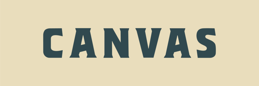
Wordmark Blue on Sand BG
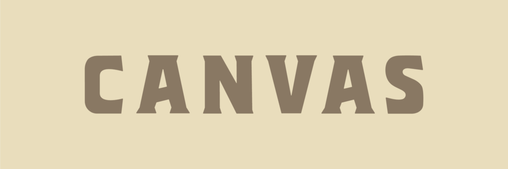
Wordmark Dark Sand on Sand
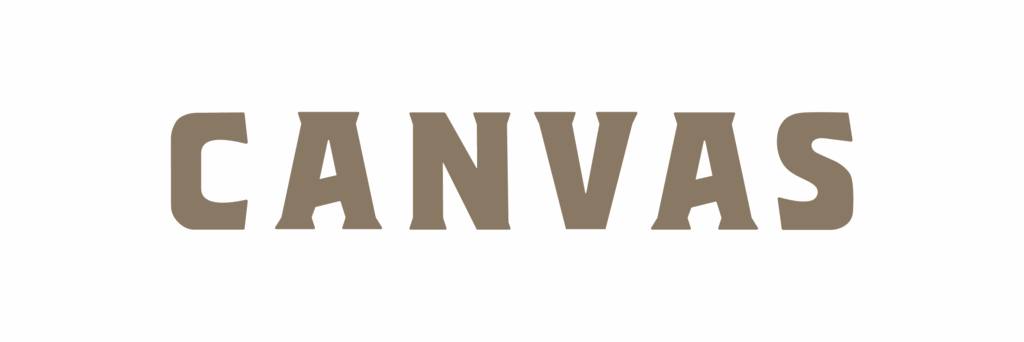
Wordmark Dark Sand with no BG
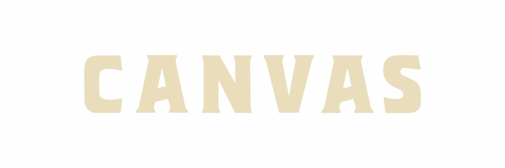
Wordmark Sand with no BG
Wordmark Black with no BG
Wordmark Mint with no BG

Wordmark White with no BG

Coin Logo
The Canvas Coin logo is a simplified mark utilizing the 'C' from the main wordmark, while keeping with brand recognition.
Two variations of the Coin logos include:
- The Coin - Spiral
- The Coin - Border
The icon serves as a compact, versatile expression of the brand, easily recognizable even at small sizes. It is ideal for use in contexts where space is limited or where a strong, symbolic presence is preferred—such as app icons, social media avatars, or website favicons.

Sub-brands
The Canvas sub-brands utilize the 'Canvas' wordmark with the sub-brand identifier below.
Other variations of the sub-brand logos include:
- A horizontal wordmark orientation
- A horizontal wordmark orientation with stars
- A horizontal wordmark orientation with the sub-header copy, "EST 2009" on the sides of a star
- A horizontal wordmark orientation with the sub-header copy, "EST 2009" on the sides of Texas
- A round, badge orientation
- with Texas
- with a Star
- with All Stars
our logo
Usage
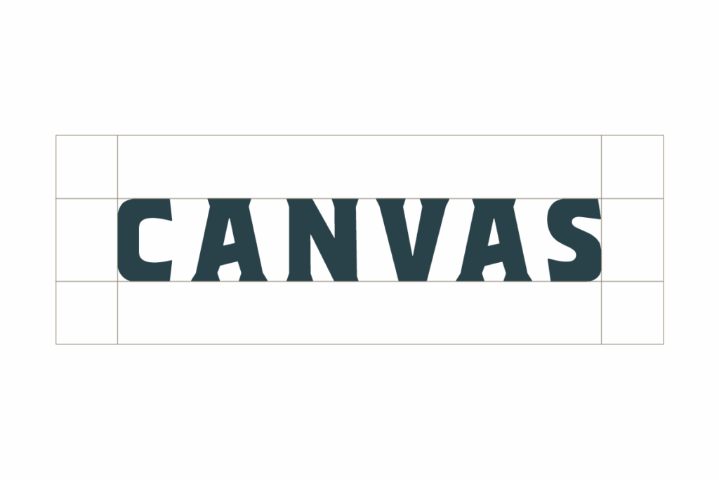
Safe Space
When displaying any of the primary logo variations, maintain ample space around it to avoid crowding or interference from other elements. To achieve this, don’t place anything around the “safe space” equivalent to 75% the height of the logo.
Please Don't
Use unapproved color combinations or colors

Distort the logo and elements

Use alt fonts

Place on backgrounds that make elements hard to read
Canvas in
Color
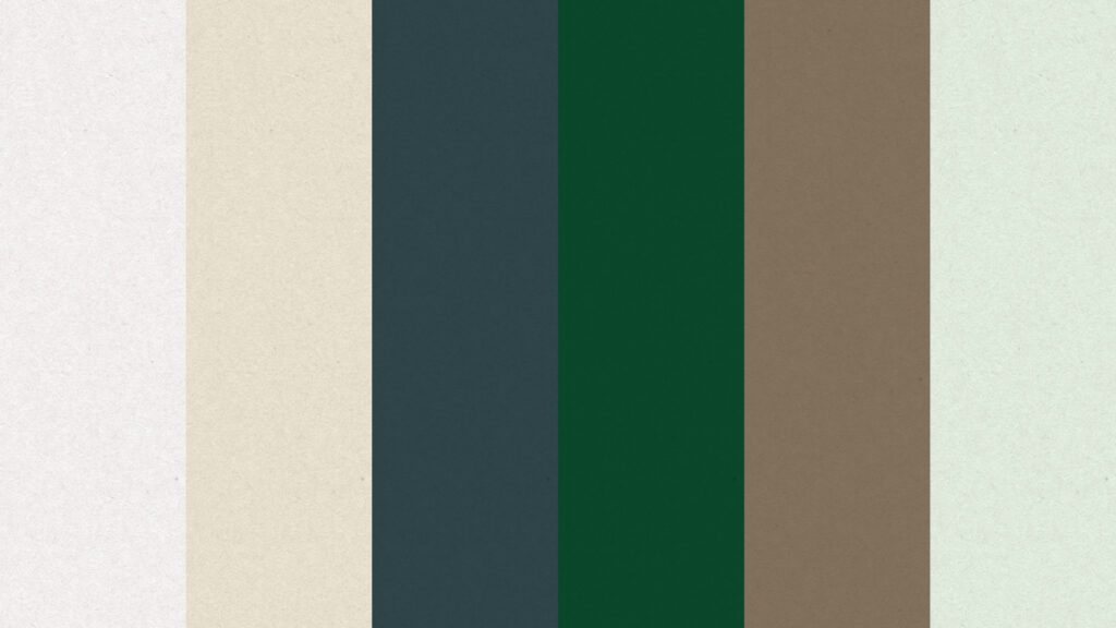
Primary Colors
Capital Black
- Hex #282423
- RGB 40, 36, 35
- CMYK 94, 77, 53, 94
- Pantone 419 C
Bank Note White
- Hex #fffaf5
- RGB 255 250 245
- CMYK 0, 2, 2, 0
- Pantone 7506 C @ 40%
Investment Blue
- Hex #31494F
- RGB 49, 73, 79
- CMYK 77, 46, 45, 56
- Pantone 6118 C
Mint
- Hex #EDf9ED
- RGB 237, 249, 237
- CMYK 9, 2, 9, 0
- Pantone 7485 C
Lake Travis Sand
- Hex #E9DDBC
- RGB 233, 221, 188
- CMYK 7 11 30 0
- Pantone 7506 C
Lake Travis Dark Sand
- Hex #897863
- RGB 137, 120, 99
- CMYK 36, 36, 56, 6
- Pantone 2325 C
Secondary Colors
Our Secondary Colors are to be used sparingly (less than 20%, visually) for backgrounds, design elements, and to highlight key information such as subheaders.
Zilker Lime
- Hex #D3FD6C
- RGB 211, 253, 108
- CMYK 25, 0, 90, 0
- Pantone 2296 C
Sunset Rorange
- Hex #f15a3d
- RGB 241, 90, 61
- CMYK 0, 85, 85, 0
- Pantone 1645 C
Money Green
- Hex #0B4C2E
- RGB 11, 76, 46
- CMYK 85, 16, 76, 66
- Pantone 6161 C
Typography
Fonts & Styling
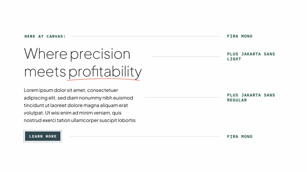
Eyebrow/Subheadings/Buttons
Fira Mono - Bold
ABCDEFGHIJKLMNOPQRSTUVWXYZ1234567890!@#$%^&
Headings
Plus Jakarta Sans - Light
Aa Bb Cc Dd Ee Ff Gg Hh Ii Jj Kk Ll Mm Nn Oo Pp Qq Rr Ss Tt Uu Vv Ww Xx Yy Zz
1234567890!@#$%^&
Body
Plus Jakarta Sans - Regular
Aa Bb Cc Dd Ee Ff Gg Hh Ii Jj Kk Ll Mm Nn Oo Pp
Qq Rr Ss Tt Uu Vv Ww Xx Yy Zz 1234567890!@#$%^&
depth through
Design Elements

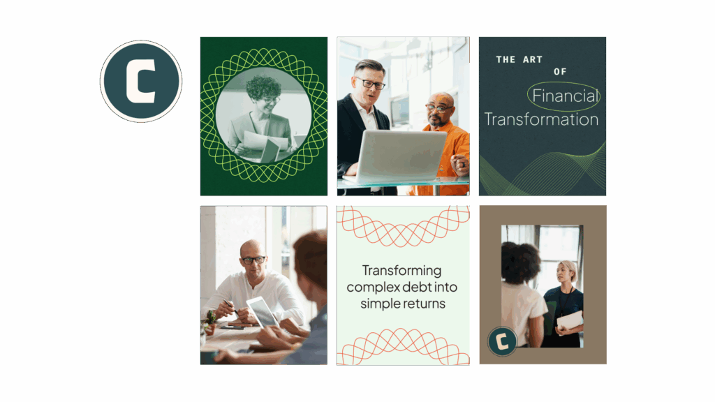
Photography
Canvas photography embodies Western Sophistication — professional yet personable. Natural light, warm tones, and clean compositions create a sense of clarity and confidence.
General Guidelines
People in Collaboration
Capture candid, conversational moments that feel genuine and grounded.
Austin Influence
Infuse warmth through natural light, organic textures, and creative workspaces.
Photography Do's
✅ Do capture real, natural gestures and expressions.
✅ Do show relevant, intentional environments.
✅ Do use warm, organic textures to contrast modern structure.
Photography Don'ts
❌ Don’t use cliché corporate stock imagery (e.g., handshakes, overly posed smiles).
❌ Don’t over-saturate or rely on harsh lighting.
Iconography
A minimal, heritage-inspired icon style that combines the simplicity of modern flat design with subtle Western character. The icons use bold, geometric silhouettes with softly rounded edges and consistent stroke weights, creating a sense of confidence and refinement.
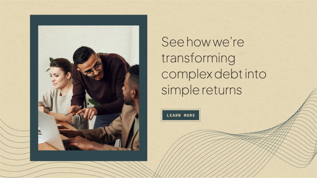
Currency Texture
Utilize our paper-like currency textures to add subtle depth and authenticity across brand applications — from web and social media graphics to printed collateral. These textures evoke the tactile quality of banknotes, grounding Canvas in a sense of permanence, craftsmanship, and trust.

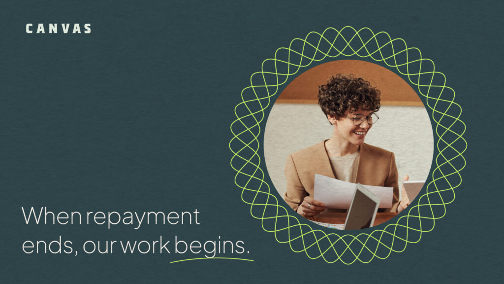
Spiral Seals
These intricate line patterns take cues from guilloché designs traditionally used in banknotes and certificates. Reimagined through a minimalist, modern approach, the Spiral Seals represent authenticity and protection, connecting Canvas’s financial expertise to a legacy of craftsmanship and credibility.

Ledger Lines
These intricate line patterns take cues from guilloché designs traditionally used in banknotes and certificates. Reimagined through a minimalist, modern approach, the Ledger Lines express flow, structure, and precision, reflecting Canvas’s commitment to clarity, balance, and trusted financial artistry.
Primary Brand
Application